April 11, 2019
By Wolfestone
In
Adapting an existing brand logo into another language is surely among the most challenging of localisation projects.
Taking a word or name that has already been heavily stylised then re-interpreting it into another language whilst keeping intact the character of the logo requires graphic design savvy.
Graphics aside, though, the standard practice for those tasked with designing brand logos in another language is to firstly create the exact phonetic spelling of the brand name - and not necessarily its meaning.
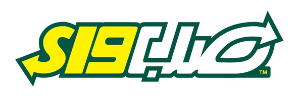
For example, the Arabic version of Subway, the international sandwich company, translates as ‘subway’ when read aloud by an Arabic speaker. It is not the Arabic word for ‘underground’ (which is, of course, the literal meaning of the word subway).
Once the spelling is decided on, it's down to a graphic designer to create a logo that captures the essence of the original. Below, for example, is the Arabic version of Subway.
As you can see, it's so close an approximation of the original that from a distance your eye might not initially register the difference.

No brand logo is too big for adaption
Even companies that have already achieved global recognition and whose original brand logo is already recognisable everywhere usually choose to adapt their logo.
Not doing so sends out the wrong message to any country you’re trying to expand into. It implies that you consider its language of lesser importance.
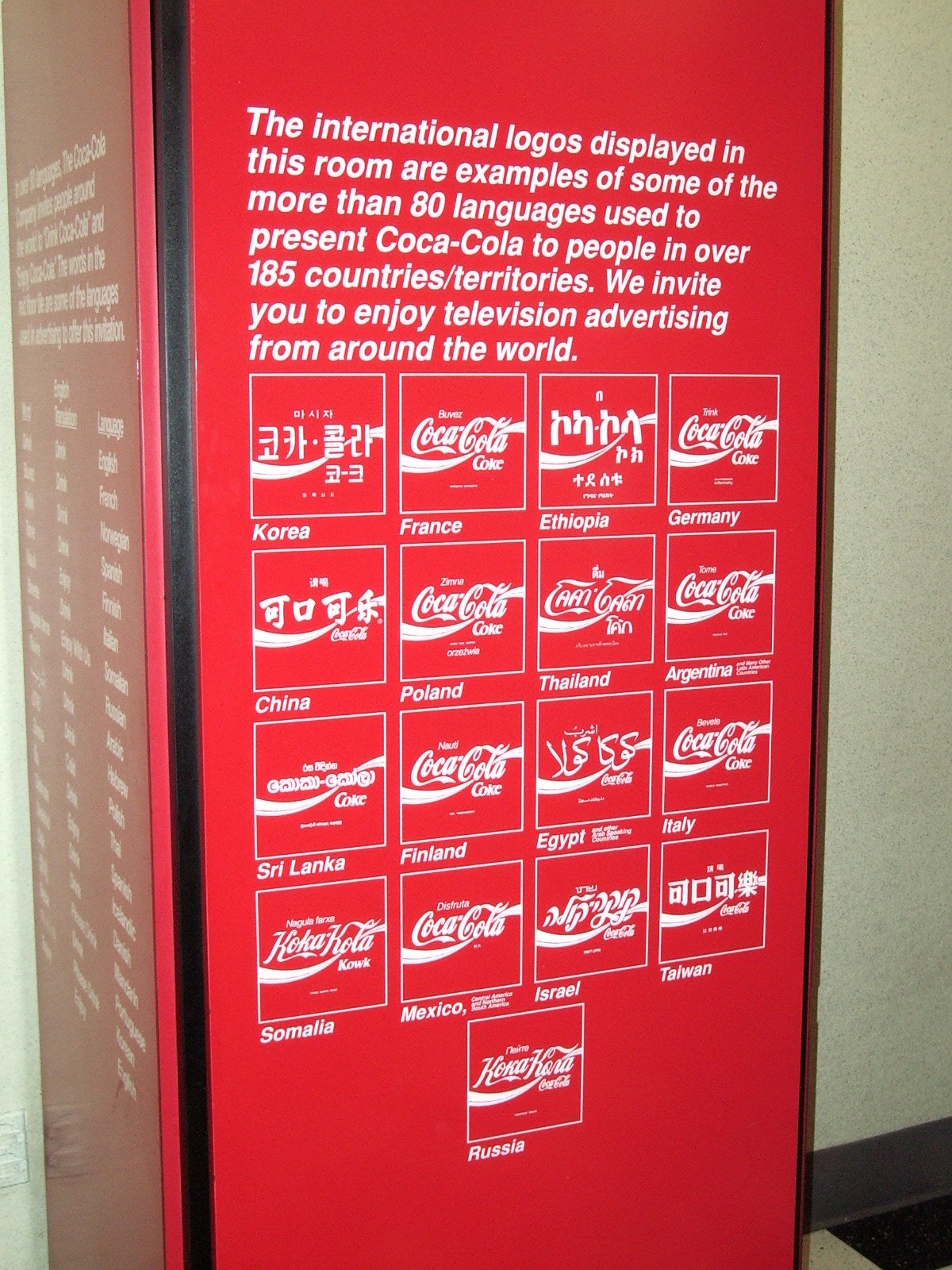
You might think a company like Coca Cola, consistently voted one of the top five most valuable global brands and sold in over 200 countries, could afford to not localise their brand logo.
With its distinctive white cursive script on a red background it has long been the most recognisable carbonated soft drink in the world.

Yet look at the image on the right.
It proves how committed Coca Cola is in effectively communicating with foreign markets on every continent.
Best placed of all are companies or brands with instantly recognisable symbols, emblems or images that don’t need to be accompanied by words.
Good examples include the shell of Shell Oil, Apple’s apple or major sports brand motifs (think of Nike’s swoosh or the three stripes of Adidas).
Combination brand logos
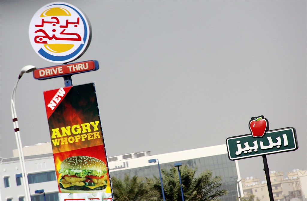
Logos that are a combination of both usually require minimum interpretation - as seen, for example, with the Arabic version of the Burger King logo (below).
The colours and design are the same, albeit flipped to read from right to left.
But the word sandwiched between two halves of the burger bun is in Arabic and phonetically spells out the English words ‘burger’ and ‘king’, rather than the Arabic words for ‘burger’ and ‘king’.

Regardless of what the word says, however, the logo would be instantly recognisable as that of Burger King’s, rendering the actual words redundant.
Starbucks' logo in Saudi
On very rare occasions, in certain parts of the world, even a word-free logo (i.e.,one that contains only an image or emblem) has to be substantially localised so as not to offend cultural sensibilities.
In 1992, the Starbucks logo, featuring a crown-wearing mermaid within a circle, was deemed too risque for Saudi Arabia. It had to be be swapped for a simple image of her crown alone bobbing on waves.
To this day the sultry siren remains absent in the country, despite her presence posing no problems in more liberal neighbouring Gulf states such as the UAE and Qatar.
A two-way thing
So far we have looked at the logos of Western (American) brands being translated into foreign languages. But globalisation means it frequently occurs the other way, too, with non-Western companies often retaining elements of their native script when targeting English-speaking markets.
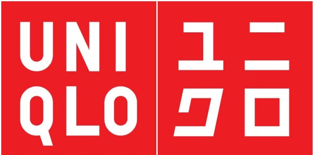
Interestingly, the Japanese clothing brand Uniqlo (see their minimalist logo below) usually displays the Japanese version of the logo alongside the English on the exterior of their stores in Europe and the US.

The logo of Emirates, the Dubai-based airline, features an artistically rendered condensation of Arabic calligraphy atop the word 'Emirates'. To the non-Arabic reader, the Arabic script looks much like a logo (which is why it works so well).
But it actually reads 'Al Imarat', which means ‘the Emirates.’ Essentially, then, it's a logo comprising the same word written twice – albeit in two different languages.
Adapting brand logos into other languages is something that might be costly and time-consuming but it'll be worth it in the long-run. And it might even give your branding a unique look, and the edge over your competitors.
Leave your multilingual branding to the professionals
Wolfestone is a Swansea-based, multi-award-winning language service provider which offers everything from localisation to translation services. We only use translators who have passed through our extremely rigorous selection process.
They must have a minimum of five years experience plus a diploma, degree or postgraduate degree in translation or language studies. The localisation specialists we use are native to the country with which you aim to engage and they have experience of working on localisation projects in every sector, from manufacturing to media to science.
Want to find out more? Click here and get in touch.
Information Correct: 11/04/2019
